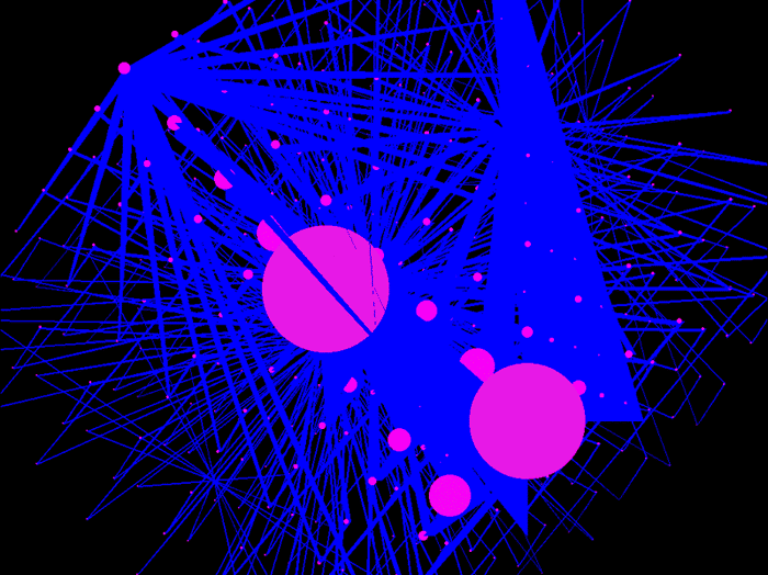
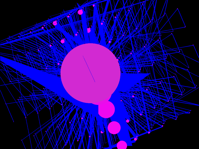
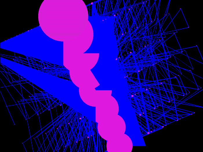
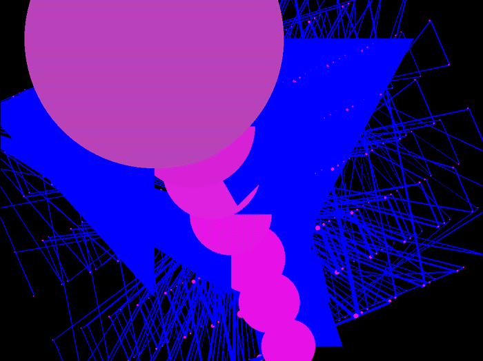
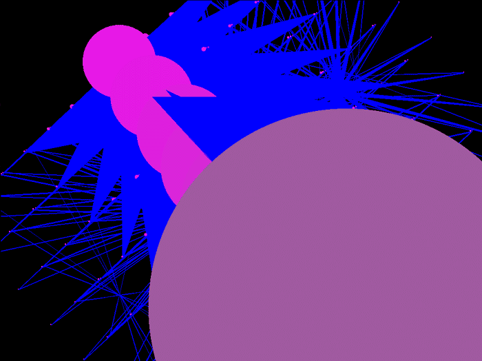
These are images of a programming accident involving perspective from around 2000. I liked the result so took these screen shots at various stages.
The colours were deliberately garish to highlight the three elements: vertices, the polygon edges joining the vertices, and colours indicating the distance of the (spherical) vertices.
The scaling on the spheres as they moved along the z-axis (back and forward) was too extreme.